I've
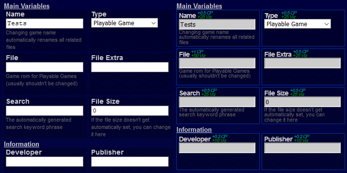
updated the way that the site renders input fields, specifically text input. Some of you might not notice the difference and it's really hard to explain how it's different but you'll know it when you see it.
I also enhanced the look of the "input box" on many pages of the site. Pretty much any newer page of the site that allows users to edit or submit data uses what I'm calling an "input box" that I created which helps organize and display the various forms of data better. I created this "input box" quite a while ago but I've always felt it could be easier to use and look at and so that's what I did, simply made it more condensed but didn't compromise the look at all and in fact made it more appealing.
It's a small
update and yet took me a few hours to do but the time was worth it since even I was kinda getting annoyed with how some of the form elements were. Some of the pages that would be benefited from this
update include the
Theme Creator, all post/thread edit/submission pages, some features I've been working on that will be released soon, and a few other pages.
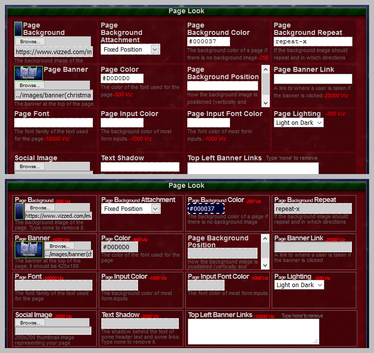
It's hard to explain the changes I made but I took a screenshot to show a before and after comparison, as you can see below. The top shows before and the bottom shows after. In both examples I'm hovering the mouse over the 'Page Background Position' box to show how it looks when you hover the mouse (it's intended to hide less when hovering).
 Staff :
 Let me know if this
update causes problems on any pages. It's possible I forget to test a few.


 User Notice
  Davideo7 is Online
| ID: 1374938 | 291 Words
Davideo7 is Online
| ID: 1374938 | 291 Words
 Davideo7 is Online