Chaos! Chaos! And More Chaos!
Sonic Chaos Quest Review
Hi there, it is I BlueBlur93 and I shall be reviewing "Sonic Chaos Quest".
"Sonic Chaos Quest" is a fairly recent Sonic 1 hack developed by Narcologer, which features many new additions from the original game, such as a complete graphic overhaul, re-invented bosses, new music (some of which (I THINK) is original), modified badniks in terms of mechanics and tons of custom sprites.
GRAPHICS
Overall the graphics look really nice, however it feels like there's something missing, and that something is shading/shadowing.
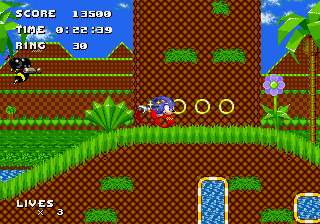
If you look at the first zone "Aberdeen Land Zone", as I said, the scenery looks really nice, but it lacks at least shadowing, which makes it look so 2D, and that's not said in a positive manner. However, that said, I really do like the background, it looks so original and refined. The palette for that zone hasn't changed all that much, I think the sky is a lighter shade of blue compared to the blue, but the palette fits in with the tile art.
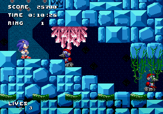
The next zone "Dangerous Pit Zone" is a overhaul of the original "Labyrinth Zone". The tile art in this has shadowing. YAAAAAY! But it looks quite basic, yet fitting. What gets me about the zone's art, is the background. I really don't know what it supposed to be or represent, but all I can presume is that it's a machine of sorts with flashing lights, of which can be quite distracting when underwater. However, I must admit it does look cool, but I don't personally think it fits in with this zone, unless it is supposed to be an underwater machine zone like... thing. 
Zone 3 is "Border Fort Zone" which replaces "Marble Zone". Okay the graphics have gone back to the way it was in Zone 1, by that I mean lack of shadowing. It looks too cartoon-like, which again doesn't fit with the custom Sonic sprite (which by the way, I really like the custom Sonic Sprite, it looks really cool!). Anyway back to this zone, I like what has been done to the background. I like the fact that you can see part of Zone 1 in the background, so it looks like you can actually see your progress. Obviously not shown Zone 2's background, because Sonic was in a deep dark well.. I mean pit. The palette what has been used seems mediocre, because it's overused in many hacks, with the grey blocks and darker blue sky. I think a bit more imagination could've been put into the palette at least. ...And then the shadowing. 
Next up is Zone 4 which is "Speed Row Zone", replacing "Star Light Zone". Out of all of the zones, this particular zone seems to have the most complete looking graphics, in terms of the palette and shadowing. Some of the tiles though looks quite basic, kind of similar to the tiles from Zone 2, however again it looks quite fitting.
Zone 5 is "Mechanograd Zone"  (weird name but okay), which replaces "Spring Yard Zone". The background looks awfully similar to Zone 4's background, but at the same it looks kind of different I guess. And I know I've said this way too many times, but there isn't any shadowing! I like the idea of the tiles and the background but without the shadowing it slightly repels me from fully liking it. Also some of the palette on certain objects looks wrong. If you look at a moving platform for instance in this zone, the base color is purple, however there is an odd color bordering it, which I think is part of a palette limitation, so to bypass this I think Narco should find an alternate color to blend in with the scenery. (weird name but okay), which replaces "Spring Yard Zone". The background looks awfully similar to Zone 4's background, but at the same it looks kind of different I guess. And I know I've said this way too many times, but there isn't any shadowing! I like the idea of the tiles and the background but without the shadowing it slightly repels me from fully liking it. Also some of the palette on certain objects looks wrong. If you look at a moving platform for instance in this zone, the base color is purple, however there is an odd color bordering it, which I think is part of a palette limitation, so to bypass this I think Narco should find an alternate color to blend in with the scenery.
Here we are Zone 6, "Hydrostation Zone". Now before I dig into this zone I am going to say that I do like the concept of this zone overall I just don't think it suits being a final zone for a big finale to the hack. I mean what is Eggman (Robotnik) doing with a hydro-station, and looking at the scenery it doesn't look like it's a bad place either, so I'm a bit confused about that. But not thinking about it as a final zone, the graphics look nice, the palette suits the atmosphere. It's just a shame that the atmosphere looks too "happy" for a final zone.
So all in all, it's clear that a lot of thought and detail has been put into the graphics, but it just lacks shadowing, which is a major part if the hack isn't supposed to have purposely a cartoon art style.
SOUND
The selected music that has been used within this hack is somewhat average. However there are quite a few acts which have unfitting music assigned. The best example is all three acts in Zone 6. If the current Zone 6 wasn't the final zone, then everything about it, being the graphics and the music, would fit nicely. But because the theme for act 1 e.g. is one of the HUB themes in Knuckles Chaotix, it's too much of a happy tone for a final zone before you fight Eggman one last time. So I personally think that drastic changes are needed for some of the music.
Difficulty and Depth
This time I'm merging "Difficulty and Depth" as one section because they are both relevant to each other. In terms of difficulty overall it is a very difficult game play, which leads on to the depth, because it's so difficult you keep on getting hurt, which really slows you down. But back to the difficulty side, one of the reasons why it's difficult is because of all of the bad placements of objects and badniks. They have been placed at the most awkward places allowing you to get hurt almost all the time, unless you have ninja reflexes. Also there are way too many badniks clustered together, and too many clusters of them. 
Lastly, as you've read from the intro, Narco has modified the badniks, but the modifications of what has been done to badniks have vastly incremented the speed of them, so for instance in zone 1, the motobugs are now really fast, however they are too fast and you barely have a split second to react, so I think maybe reducing the speed of all modified enemies might be a good idea. Narco doesn't need to reduce it all the way to defaults, just need to reduce it so people can have better chance of dodging the enemies, and allowing people keep their rings so they can enter special stages, presuming that there's still a big ring at the end of an act that is.
ADDICTIVENESS
This sadly isn't a hack that I would want to play again, at least not for a while. Sorry 
One last thing I would like to point out as well is the level isn't the best when it comes to the more battle-like stages (i.e Marble and Labyrinth Zone), because there are blocks of the level layout have just pointless dead ends, and pointless spike positions (i.e Labytinth Zone). Be a bit more creative with the layout, and try not to keep on re-using the same sequence of level editing blocks because it does get rather repetitive, which I know is hard but just think about the level design.
Overall, I like the detail that has been put into this hack and the concept of the zones. This hack just lacks a few things like SHADOWING!! ahem... solid level design, well-blended palettes (mainly Spring Yard), repetitive levels, and poorly placed objects and badniks.
This hack does have potential, so please do more on it!
RANK
C
|


 User Notice
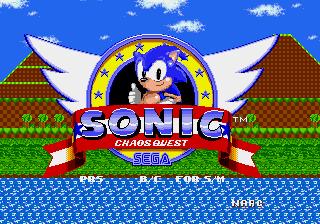


 BlueBlur93 is Offline
| ID: 1190559 | 1296 Words
BlueBlur93 is Offline
| ID: 1190559 | 1296 Words
 BlueBlur93 is Offline


